Graphs add beauty to our sheet as well as users can digest it instantly. They convert the boring sheet into visualization and it looks attractive. I will teach you how to create a bar graph on Google sheets.
Google sheet helps us to calculate, analyze, and organize the data easily. But this sheet looks dull and boring without charts. Users give more priority to graphic representation. And I will guide you on how to create a bar graph in google sheets.
Do you find it difficult to use VlookUp for multiple sheets? You can read my guide where I have discussed in detail how to use vlookup function.
Benefits of Google Sheets and Charts
Google sheet is one of the best web-based spreadsheets where we can do almost all the things we do in MS Excel. When the spreadsheet contains a ton of data, it looks weird and many users don’t want to read the whole sheet while they prefer graphic representation or visualize your sheet.
For this purpose, charts are very helpful. Charts attract the users with its beautiful colors and the user happily reads the data written in a large dull sheet. In a google sheet, there are many kinds of charts available. But I will teach you how to create a bar graph in google sheets?
How to Create a Bar Graph in Google Sheets?
Now, we will discuss how to create a bar graph on Google sheets. We will create the bar graph in 4 simple steps. These steps are given below:
- Enter your data in Google Sheet
- Highlight the targeted cells
- Click on Chart in the Insert menu
- customize or modify your chart
These are simple steps to create a bar graph in Google sheet. Don’t worry, I will discuss them in detail one by one so that you can better understand. Creating a graph is one of the easy tasks since don’t need to do anything. The spreadsheet program takes all this headache.
If you use the spreadsheet regularly then, you must know beyond the basics like linking cells in Excel the same worksheet. It will help you to make your task easy. Read this guide as well.
1) Entering Data into Sheet
In this first step, we will fill the sheet with data. You can enter random data only for practice or import data from other sheets for a better experience. Only this step is a time taking since we have to put data in an organized way so that we can see better results.
I have prepared a small sheet to guide you on how to create a bar graph in Google sheets. The sheet is about product sales. Take a look at the sheet first:
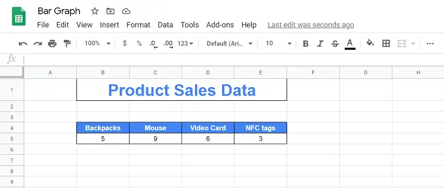
In the first column, I have listed the product names and the sales are listed in the second column. I want to show this data graphically so that the user can understand the sheet quickly without reading the data.
So, you have to create the sheet according to you in an organized way. Remember that if you have entered the data in a good way then, the graph will also look amazing and meaningful.
If you use MS Word then, you must add the best Microsoft Add-ins for Word which will make your work super easy and will save you time.
2) Highlighting the Cells
Step 2, highlights the cells you want to create a bar graph. After successfully entering data into cells, the next and step is to highlight that data. I don’t think you don’t know how to select or highlight the cells in Google sheet since it is the same as we do in MS Excel. If you use a spreadsheet then must know about it because it is the basic thing.
However, if you don’t know how to select the multiple cells then, I will show you two ways to do that. These methods are given below:
1) Left-click on the cell, you want to start from and drag the mouse over the cells you want to select and release the mouse button on the last cell where you want to end.
2) The second method is, hold the shift key on the first cell and use arrow keys while pressing the shift to select the cells. This method is also easy but the first one is the easiest.
So, these are two easy methods to highlight the cells in Google Sheet as well as MS Excel. You can choose any method to select multiple cells. So, the second step is to highlight the cells, you want to create a graph.
Note: If you have a very large sheet, you can create a bar graph of a small part of the sheet as well.
Adding a degree symbol in Word is a challenging task since it takes out a lot of time. Here, I have discussed 4 ways to add degree symbols in MS word easily.
3) Adding Bar Graph
Now, we will create a bar graph of the cells you selected in the above section. To create a bar graph, you must select the cells first, and then, you will be able to insert a chart in the sheet. Follow the given steps to create the bar graph:
1) Once you have selected the cells, Navigate to the Insert tab in the top menu bar.
2) Click on Chart in the drop-down menu.
3) The graph will appear on the sheet-like below:
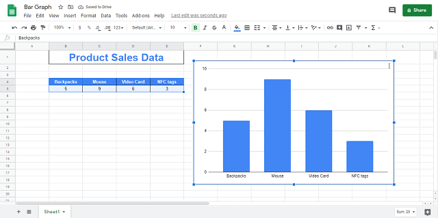
You can see that each bar has a name and the bar height represents how large the number is. We can change all the formatting of the graph. By default, Google Sheet creates a column graph and we can change its type as well.
4) Customize the Bar Graph
In this last and important step, we customize the graph automatically created by Google sheets. I will explain the necessary customizations. Let’s start out and modify the chart.
1) Click on the graph and then, click on three dots on the upper right corner and click on the Edit chart like below:
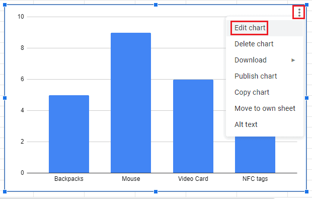
It will open a chart editor where we will modify the chart.
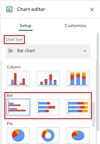
2) If Google sheet creates another chart then, choose a bar chart in chart type as below:
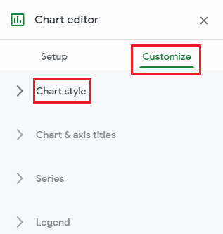
3) Now, go to customize tab and the first option is Chart Style
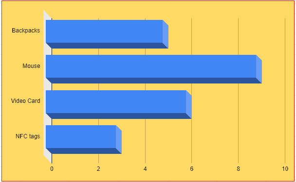
4) You can change the background color, font-family, chart border-color, and layout settings like 3D, Maximize. After applying all the settings, my chart has become like this and looking beautiful:
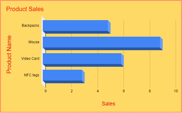
5) The next customization is Chart and axis titles. Here you can add Chart Title and changes the title color, font, etc. After writing the titles, my chart looks like this, horizontal and vertical axis name:
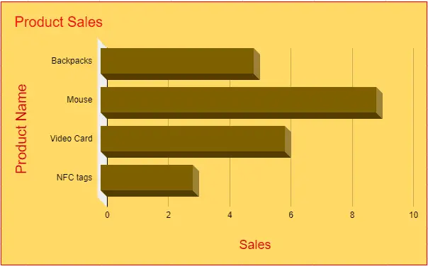
6) The next modification is series. In this section, we change the bar color. See my chart has become like this:
7) We don’t need to learn about Legend customization since we are learning the basics of the bar graph.
8) The next two customizations are the Horizontal axis and Vertical axis. These are almost the same. In this section, we can change the label size, color, font, etc both horizontally and vertically. After applying these settings, my chart looks like this:
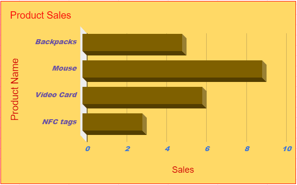
These are all customizations available in Google Sheet. You can also apply these same customizations in every type of graph like Column, Line, Pie, etc. Now, you have learned about how to create a bar graph on Google sheets. After this, you are able to design any kind of bar graph and visualize your data.
Final Thoughts on How To Create a Bar Graph in Google Sheets?
This is the simple and easy guide about how to create a bar graph on Google sheets. Graphs help us to understand the complex sheet easily. Most of the users prefer graphical representation over data written in the cells. If you have a large sheet then, it becomes more difficult. That’s why charts are a simple solution to this problem.


